Shape Drawable Button .Xml Android Studio

Hello cod3r’s i have prepared an example of Custom_Button with the help of .xml file’s

To help you understand shape drawable

What is shape drawable*

Shape drawable is nothing more just a collection of .xml file’s with that

you can create your own awesome Custom_Button as well as you can

create more with that.

Let’s Get Into Code!

Tutorial Level

Rating: 3 out of 5.

Subscribe us for more tutorial’s LIKE THIS..

first of all after gradle sync

we need to create a new resource file so for that we will go intro res > drawable then we will right click on the drawable folder and pick a new resources file from the new section the first option on the popup menu. as you can see below.

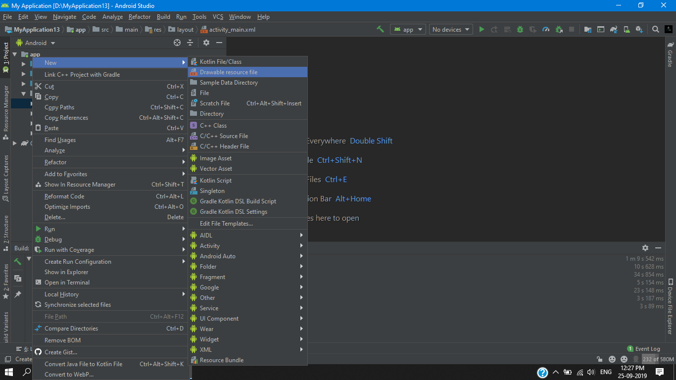
we will name this file as our button_default then we hit ok after that we will have our first button_default.xml file so for this example we’ill need three .xml file’s but as for now we will work on this .xml file i will tell you more as we go further in this tutorial.

button_default.xml

first we change the default attribute to shape and give it another attribute android:shape=”rectangle”> and then we add another attribute <gradient in this we give end color and start color

android:startColor="#0000ff"
android:endColor="#fff"

for our gradient effect then we give some padding and a stroke,Corner’s as you can see below

<?xml version="1.0" encoding="utf-8"?>
<shape xmlns:android="http://schemas.android.com/apk/res/android"
    android:shape="rectangle"
    >
    <gradient
        android:startColor="#0000ff"
        android:endColor="#fff"
        />
        <padding
            android:bottom="7dp"
            android:top="7dp"
            android:right="7dp"
            android:left="7dp"/>
    <stroke
        android:width="2dp"
        android:color="#9C27B0"/>

    <corners android:radius="15dp"/>

</shape>

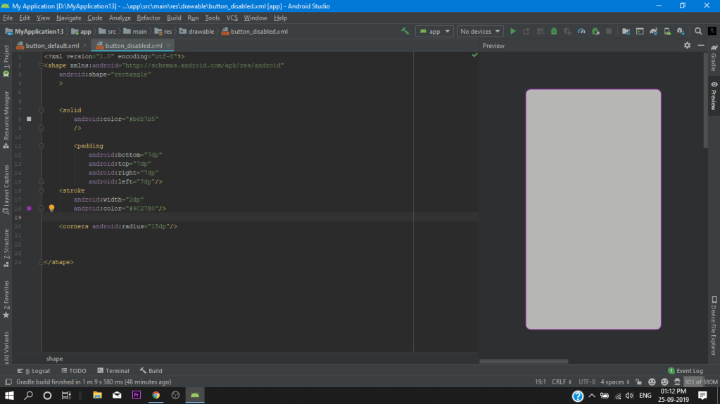
after completing our default_button.xml we copy all the codes for our two other .Xml file’s as i mentioned above so we go to our drawable folder again and create another resource file as button_disabled and we paste our code in it. then simply we change our color’s to gray as you can see below (for creating a disabled effect).

button_disabled.xml

<?xml version="1.0" encoding="utf-8"?>
<shape xmlns:android="http://schemas.android.com/apk/res/android"
    android:shape="rectangle"
    >


    <solid
        android:color="#b6b7b5"
        />

        <padding
            android:bottom="7dp"
            android:top="7dp"
            android:right="7dp"
            android:left="7dp"/>
    <stroke
        android:width="2dp"
        android:color="#9C27B0"/>

    <corners android:radius="15dp"/>


</shape>

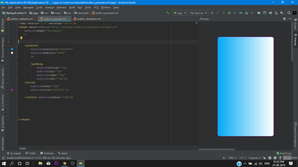
After that we create our 3rd resource file button_pressed.xml and again pase all code as we did earlier in the button_disabled.xml and just change the gradient color for a
(pressed effect).

android:startColor="#03A9F4"
android:endColor="#fff"

button_pressed.xml

<?xml version="1.0" encoding="utf-8"?>
<shape xmlns:android="http://schemas.android.com/apk/res/android"
    android:shape="rectangle"
    >


    <gradient
        android:startColor="#03A9F4"
        android:endColor="#fff"
        />

        <padding
            android:bottom="7dp"
            android:top="7dp"
            android:right="7dp"
            android:left="7dp"/>
    <stroke
        android:width="2dp"
        android:color="#9C27B0"/>

    <corners android:radius="15dp"/>


</shape>

We have successfully created our all resources file for our shape drawable and now we have to attached all the resources file to a single .xml file for we can call it in our project

we give it a name custom_button

custom_button.xml

in this xml we dont change the default attribute and in the selector we assign our button as you can see below

<?xml version="1.0" encoding="utf-8"?>
<selector xmlns:android="http://schemas.android.com/apk/res/android">


    <item
        android:state_pressed="true"
        android:drawable="@drawable/button_pressed"/>
    <item
        android:state_enabled="false"
        android:drawable="@drawable/button_disabled"/>
    <item
        android:drawable="@drawable/button_default"/>

                                                                    
</selector>

Main Activity.Xml

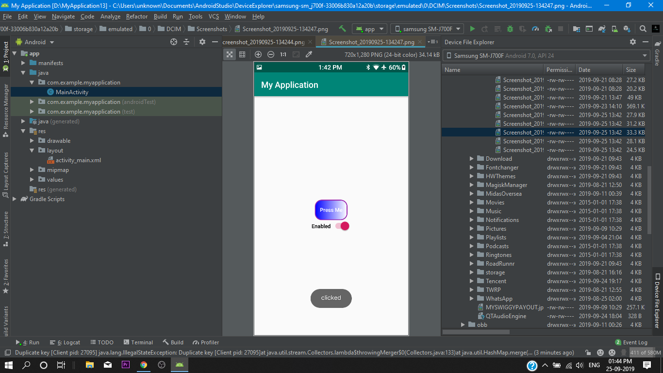
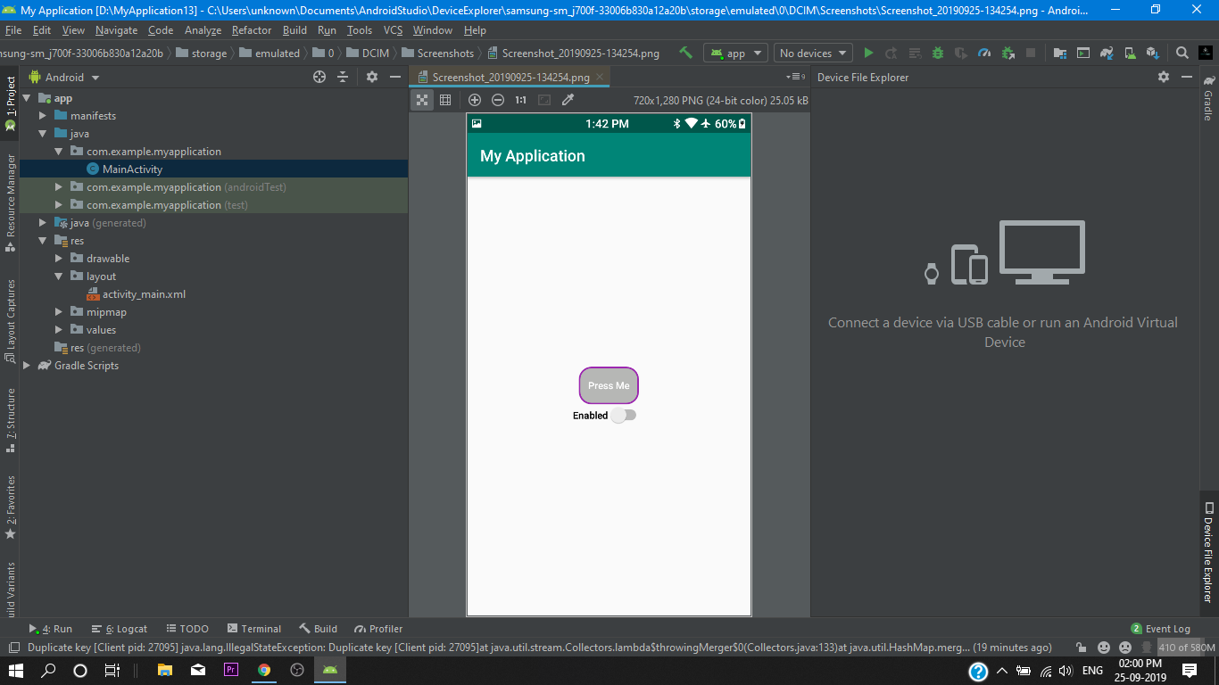
Finally we go into our Main Activity.xml and we add a button and set the background to our @drawable/custom_button and after doing this the system will take our three custom buttons as a one custom button and we will get our custom button background.

then we set a switch for disable purpose.

<?xml version="1.0" encoding="utf-8"?>
<LinearLayout xmlns:android="http://schemas.android.com/apk/res/android"
    xmlns:app="http://schemas.android.com/apk/res-auto"
    xmlns:tools="http://schemas.android.com/tools"
    android:layout_width="match_parent"
    android:layout_height="match_parent"
    android:gravity="center"
    android:orientation="vertical"
    tools:context=".MainActivity">

    <Button
        android:id="@+id/btn"
        android:layout_width="wrap_content"
        android:layout_height="wrap_content"
        android:paddingBottom="8dp"
        android:background="@drawable/custom_button"
        android:text="Press Me" />


    <Switch
        android:id="@+id/btnSwitch"
        android:layout_width="wrap_content"
        android:layout_height="wrap_content"
        android:checked="true"
        android:text="Enabled"
        />


</LinearLayout>

after assigning the button and switch we go to our main activity.java file for give a behavior for our widgets.

Main Activity.JAVA

package com.example.myapplication;

import androidx.appcompat.app.AppCompatActivity;

import android.os.Bundle;
import android.view.View;
import android.widget.Button;
import android.widget.CompoundButton;
import android.widget.Switch;
import android.widget.Toast;

public class MainActivity extends AppCompatActivity {

    @Override
    protected void onCreate(Bundle savedInstanceState) {
        super.onCreate(savedInstanceState);
        setContentView(R.layout.activity_main);

        final Button customButton = findViewById(R.id.btn);
        Switch switchButton= findViewById(R.id.btnSwitch);

        customButton.setOnClickListener(new View.OnClickListener() {
            @Override
            public void onClick(View view) {
               Toast.makeText(MainActivity.this,"clicked", Toast.LENGTH_LONG).show();


            }
        });

        switchButton.setOnCheckedChangeListener(new CompoundButton.OnCheckedChangeListener() {
            @Override
            public void onCheckedChanged(CompoundButton ButtonView, boolean isChecked) {
                if (isChecked) {
                    customButton.setEnabled(true);
                } else {
                    customButton.setEnabled(false);
                }
            }
        });
    }
}

We have successfully created our shape drawable button. So Let’s Test it out!

So That’s all for today cod3’rs i hope now you got a understanding of shape drawable and you can also use this method in your projects to create a awesome looking custom button.

if you like this tutorial then make sure stay tuned for future upcoming tutorial’s

Dialogue Box Android Studio

hello Cod3r’s Today you will learn about how to add dialog in android studio .

what you will learn in this tutorial

how to add dialog in app projectAlertDialog.Builder builder
how to use java class in appAppCompatDialogFragment
TUTORIAL LEVEL

Rating: 2 out of 5.

MAIN ACTIVITY.XML

so first of all we set a button for the dialog box then we arrange all the widgets into our relative layout then we assign all widgets to there corresponding id’s.

<?xml version="1.0" encoding="utf-8"?>
<RelativeLayout xmlns:android="http://schemas.android.com/apk/res/android"
    xmlns:app="http://schemas.android.com/apk/res-auto"
    xmlns:tools="http://schemas.android.com/tools"
    android:layout_width="match_parent"
    android:layout_height="match_parent"
    tools:context=".MainActivity"
    android:background="#7fdbd1"
    >


    <TextView
        android:id="@+id/tv1"
        android:layout_width="match_parent"
        android:layout_height="wrap_content"
        android:text="This is The Example of using Dialog"
        android:textSize="40sp"
        android:gravity="center_horizontal"
        />

    <TextView
        android:id="@+id/tv2"
        android:layout_below="@+id/tv1"
        android:layout_width="match_parent"
        android:layout_height="wrap_content"
        android:gravity="center_horizontal"
        android:textStyle="bold"
        android:textColor="#a8a232"
        android:text="Tap Button below To Display the dialog"
        android:textSize="20dp" />

    <ImageView
        android:layout_width="wrap_content"
        android:layout_height="wrap_content"
        android:layout_below="@+id/tv2"
        android:layout_alignParentEnd="true"
        android:layout_alignParentRight="true"
        android:layout_marginTop="81dp"
        android:layout_marginEnd="152dp"
        android:layout_marginRight="152dp"
        android:foregroundGravity="center_horizontal"
        android:src="@drawable/ic_launcher_foreground" />

    <Button
        android:id="@+id/button"
        android:layout_width="wrap_content"
        android:layout_height="wrap_content"
        android:layout_alignParentStart="true"
        android:layout_alignParentLeft="true"
        android:layout_alignParentEnd="true"
        android:layout_alignParentRight="true"
        android:layout_alignParentBottom="true"
        android:layout_marginStart="163dp"
        android:layout_marginLeft="163dp"
        android:layout_marginEnd="160dp"
        android:layout_marginRight="160dp"
        android:layout_marginBottom="179dp"
        android:background="#000000"
        android:text="Open!"
        android:textColor="#b634c9"
        app:layout_constraintBottom_toBottomOf="parent"
        app:layout_constraintLeft_toLeftOf="parent"
        app:layout_constraintRight_toRightOf="parent"
        app:layout_constraintTop_toTopOf="parent" />

</RelativeLayout>

main activity.java

Here we declare are button in the main activity then we set onclick listener’s to them after setting onclick method’s we will create are method opration() {

Then we add a java class for our dialog.

package com.example.myapplication;

import androidx.appcompat.app.AppCompatActivity;

import android.os.Bundle;
import android.view.View;
import android.widget.Button;

public class MainActivity extends AppCompatActivity {

    private Button button;
    //we declare are button


    @Override
    protected void onCreate(Bundle savedInstanceState) {
        super.onCreate(savedInstanceState);
        setContentView(R.layout.activity_main);

  //we initialize are button and set a on click listener
        button=(Button)findViewById(R.id.button);
        button.setOnClickListener(new View.OnClickListener() {
            @Override
            public void onClick(View view) {
                opration();
            }
        });
    }
// in main activity we create are method opration() for that we add a java class

    public void opration() {
        dialogX dialogX = new dialogX();
        dialogX.show(getSupportFragmentManager(),"dialogX");


    }
}

DIALOG.JAVA

Finally in dialog.java file we override our oncreate method with Dialog onCreateDialog method and then with the help of AlertDialog.Builder we define are dialog box As you can see below at the code.

package com.example.myapplication;

import android.app.AlertDialog;
import android.app.Dialog;
import android.content.DialogInterface;
import android.os.Bundle;
import android.view.View;

import androidx.appcompat.app.AppCompatDialogFragment;

public class dialogX extends AppCompatDialogFragment {

    // we override our on click method with on create dialog
    @Override
    public Dialog onCreateDialog(Bundle savedInstanceState) {

        //create function here
        AlertDialog.Builder builder= new AlertDialog.Builder(getActivity());
        builder.setTitle("Operation done")
                .setMessage("Positive")
                .setPositiveButton("Ok", new DialogInterface.OnClickListener() {
                    @Override
                    public void onClick(DialogInterface dialogInterface, int i) {

                    }
                });
        //we return our function
     return builder.create();
    }
}

So That’s it For Today Cod3r’s

i hope you like this tutorial and after this you can use this method to implement this method for you app. its a cool thing right ! so subscribe for more resources and upcoming tutorial’s cause i will keep on posting for you all Cod3r’s

….